Basic layout ideas for double page spread..
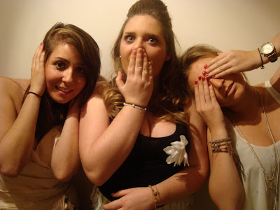
 I really liked the way of doing this for a magazine, as it incorporates many conventions of a normal music magazine. For example, one side is a big picture of the featured band, with a big headline title of the bands name.
Pictures for double page spread..


Contents Page..
Photos for the contents page..


Basic layout ideas..

 I played around with the layout of the contents page a lot before I got to the final version. The contents is one of the hardest things I felt, to achieve it looking like a conventional music magazine. However to get it to look like a conventional music magazine, I used things like the borders around the titles to make it stand out. I also took the ideas from both Q and NME magazines. The picture I added is different from the one which I used in my double page spread because there would always be more than one musician featured within the magazine.
 Front cover..
Mast head..

To begin with, the font with the red arrow next to it was the one which I wanted to use as the mast head for my magazine. However, for a magazines main title it didn't feel like the right one to have. It's very plain and doesn't stand out much at all. I soon went on to find a more appropriate one.

ORATOR STD, I thought was the best font to use with a lot of the writing within my magazine. However, there needed to be more than just two fonts to help things stand out a lot more.
Photo's for the front cover..


Basic layout for the front cover..

Typography throughout all the pages..

Why i used the fonts..
Budmo - I used Budmo mainly for certain headers and titles to stand out. Also because it looks quite like lightbulbs that you would have around your dressing table back stage. So it is very linkable to the celebrity lifestyle. It is something that would be expected to see in any magazine.
Budmo - I used Budmo mainly for certain headers and titles to stand out. Also because it looks quite like lightbulbs that you would have around your dressing table back stage. So it is very linkable to the celebrity lifestyle. It is something that would be expected to see in any magazine.
Georgia - I used for certain sub headings and as part of the questions within the double page spread. This font i think is conventional in the fact that you need a font which you can read, and doesn't look too fancy otherwise people won't necessarily want to read something they have trouble working out what it says.
Old LetterPress Type - I mainly used this font to for pull quotes. It's because it is a font which stands out from the rest of the fonts which I choose. Also the quotes on normal magazine covers etc, it is quite conventional.
Orator Std - this font is used for the main body of the article, and contents page. It's quite a clear font and so it's easy for people to read.
Also I stuck to all of these fonts throughout my magazine because in all of the magazines that I looked in they all stuck to the same fonts. As well as that the same colouring of the fonts throughout too.

No comments:
Post a Comment