When it came to the front cover, I got my inspiration through looking in music magazines like Q, NME and some more childish ones like Top of the Pops. As well as that, some pop and indie legends, whilst researching them and images which they had taken. This all helped to give me the knowledge and inspiration to make my music magazine the best that it could be.
I started by looking over my preliminary task, and realised that to make it look professional I needed to change a lot of things about it. To start with the positioning of the image, in my preliminary task it was too square, for an actual magazine. This meant I experimented with how I wanted it to look, for instance in my real task I started by deleting the background from behind them. I did this because many magazines don't have the picture background, a lot use the background colour of the front page colour. So I took this on board when making my magazine. The next thing I wanted to change from my preliminary task was the fonts. In my preliminary task there was no real separation between them all of the different, mast heads and sub headings on the front page. So to make my front cover the best that I needed it to be, I had to change this. To do so, I used a different font for the mast head, and name of the magazine, to the pull quote, and for many of the features that were on the front cover. This made it look like a real magazine. Many of the magazines that I had researched had not had, just the one simple look to it, but had eye popping features. This meant that I researched into fonts and went onto a website generator of fonts to help get me what I wanted to create. Overall I think that that was successful. Another feature which I added was the caption, and this consisted of a sneak preview of a picture which would be shown on the inside of the magazine and a short wording to make people turn to that page. However, the snappy caption which I used I don't necessarily feel it was the best word choice that I could have chosen. But it definitely felt right at the time that I chose it.
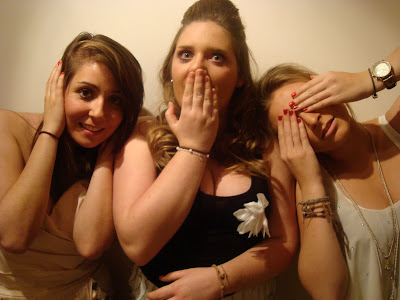
The magazines, gave me the thoughts and ideas of putting all the members of the band which I had created onto the cover. I did so with phrase 'hear no evil, see no evil, speak no evil'. This is something which many kids of 15 - 19 know, and so it is in keeping with my target audience, and what I was hoping to achieve. The picture on the front cover, I really like however, I'm not so sure if it has the right effect on top of the paint splatters. It sounds strange but I think that the band might seem too flat against it. The only thing was that I wasn't sure of how to rectify this, but I did really like the effect of the paint. The fonts I asked a few people from my class which they had liked the best, before I decided to put them into my magazine, this was because they are of the right age to fit into the target audience which I had decided.
Throughout the whole making of this magazine, I had to learn a lot of skills to help create the right feel to my magazine. The front cover, is what I wanted my music magazine to look like and how I wanted it to fit in with the rest of what I had created. There are a few things though that I would change, and that would be to have taken more photos for me to have chosen from and maybe played around when editing the image more.
Contents..
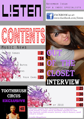
When it came to the contents page, I got a lot of my ideas by looking in some of the leading music magazines; Q, NME and some more childish ones like Top of the Pops. As well as that, some pop and indie legends, whilst researching them and images which they had taken. It all helped to give me the knowledge and inspiration to make my music magazine the best that it could be.
To help give me ideas for my contents page, I went back and looked at my prelimary task. Even though at the time it was the best that I could do with Photoshop, I knew that I needed to learn about how to improve my capabilities. To do so I researched a lot, I bought a magazine on how to use photoshop and this gave me a lot of help when trying to make it look as professional and like a music magazine as possible. Whilst looking back on my preliminary task I decided that I didn't like the way in which I had edited the photos, it was soon noticable that I needed to make them look a lot more natural. So I took a lot of this on board before going too over the top with the numerous of things which you can do to photographs with Photoshop.
With my research into music magazines, I realised that within the contents pages they had a much clearer layout. By this I mean within their magazines, there different sections and pages, very much stayed separate from one an other. There would be a section for all the music gossip under a header 'Music News' and then a bit for the viewer under 'Latest News For You' for example. So when I started to make my magazine, I took all of this into account. I didn't want to veer off course too much with my own ideas. However, not all magazines have a section from their Editor, but with the target audience I am targetting I thought that it was something that they would really appreciate. To jazz up my contents page, I added my own twist on it which I had not seen in another music magazine, this was to again add some kind of paint splashes. These paint splashes were in keeping with the colour scheme I had introduced on the front cover and which was now continuing into the contents.
There are many conventions of a normal music magazine, for example; the captions of pictures and snippets of text, the celebrity image, the title of the page and the page numbers.
Even though the Contents page is ofcourse not perfect I am genuinely very proud of it. One of the main things however that I would most likely change is the paint splashes as it is hard to read some of the text which is on top of it.
Double Page Spread..
When considering on making my double page spread, I did not have a preliminary task to look over and check. So a lot of the methods that I used was research, and asking my target audience their thoughts and opinions.
When considering what to incorporate within my double page spread, I looked through many different music magazines. However, those which were relevant to what I was trying to achieve. So for it I looked through NME and Q magazine, which are targetting the same kind of audience that I am. But to look for a more 'girls' type of music magazine I looked at younger magazines like Top of the Pops. I looked at that magazine because it is very relevant in trying to capture the specific audience in females. Most music magazines, on there double page spread have a large image of the artist which is making the artist look good, and show of the skills of the magazines designer for making the image look so good. Therefore I looked over all different kinds of double page spreads to help me get to have an idea of what I wanted.
To begin with I wanted my double page spread to have one member of the group pointing upwards at a more focused photograph of the group at the top. The same went for at the top of the photograph only difference was this time pointing down. I thought over all this would look quite effective and unique, however, in reality it just looked a bit too busy and messy when in actual fact most music magazines that I looked through were quite clean and simple. So I went on to tone down, how I portrayed my band on their double page spread. So I chose a single stand alone image which showed the band at their best I felt. I went on to edit this image with a cool background, which is quite feminine as well as coding them for being upto date with the current trends around.
There were many different methods which I could have used for the main body of my article. I chose to do something which I felt would best represent my target audience, and so I went with a one on one quite informal interview. By using that method, it is showing the characters and personalities of the bands which females are always interested in, as it helps reveal a bit more gossip. However, I had a lot more questions which I felt might have been more relevant in targetting my audience. I had done a lot more for the double page spread within the interview, however to fit it in the space that I had left I had to cut a lot of it down to make it fit. So that is a thing which I wish I could have done differently.
On the front cover, I used a theme of grey, purple and red colourings, so now I had to maintain these colours throughout. I think this was achieved in both my contents page and double page spread. In my double page spread I used the same fonts throughout it, which is maintaining with the theme of my magazine.


 Contents page


 Contents
 Front Cover


